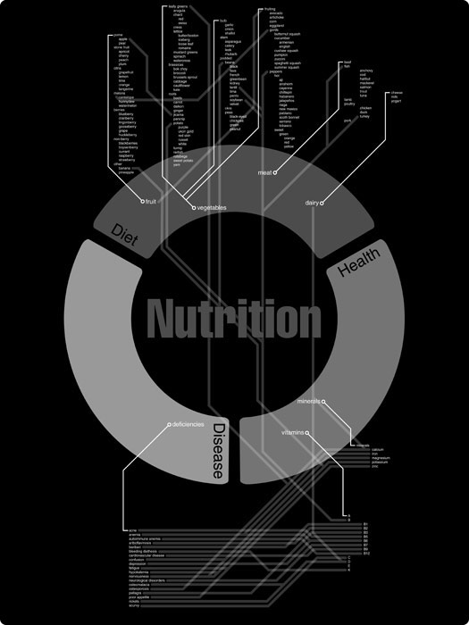
Finding a way to visually express data of any kind has been a fundamental problem since man started keeping records. Sure information can be stored on hard drives and in filing cabinets, but if people don’t find creative ways to use that data to share knowledge then what’s the point? The objective was to map data for Nutirion.gov in a visually exciting way. A sort of recreation of the food pyramid but not limited to that data set alone. My aim here was to visually map the nutritional relationship between food, it’s nutritional content, and diseases that have been linked to deficiencies in these areas. I drew inspiration from various metropolitan subway maps and technical drawings of printed circuit boards. They both represent the flow of information and that is something I wanted to capture in my design. Given more time and information I saw this design becoming a complex interconnected system of information.
Its unique visual style is one of my favorite aspects of this piece. I chose to blur the line between form and function a bit. While a simpler design could have led to better readability I felt my solution was functional enough and visually interesting.