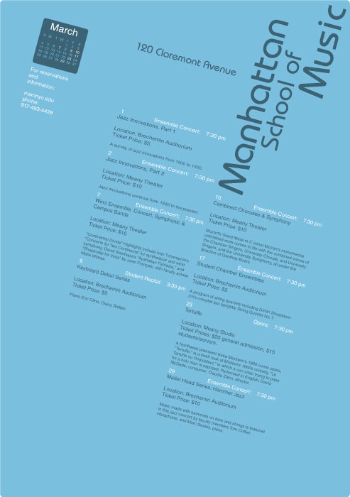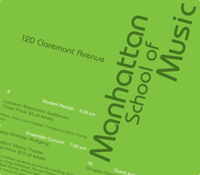
What designer doesn’t like a good infographic? Calendars are easily the most commonly used infographic, however, they have fallen victim to always using the same basic structures and roles so when I was given the chance to possibly challenge these conventions, I got excited. I wasn’t just designing a calendar but rather a system that would work universally for all months and event types. My design places event information into two easy to read columns with a simple graphical calendar to better visualize the events over the course of the month. I went for the less is more approach and was hoping to create visual interest though color and interesting typography.
While I feel the design and hierarchy shown here is solid, it leaves a lot to be desired. In hindsight, I would probably have gotten rid of the graphical calendar in favor of better one emphasizing the event dates. A bump in size and maybe floating position outside of the main column would probably do the trick. Some tweaks to the typopgraphic spacing like loosening up the line heights would help with legibility as well as making the actual calendar details a bit smaller to help with hierarchy. There is a lot to love about this design; in truth, it’s pretty good, but it’s probably one revision away from being great.