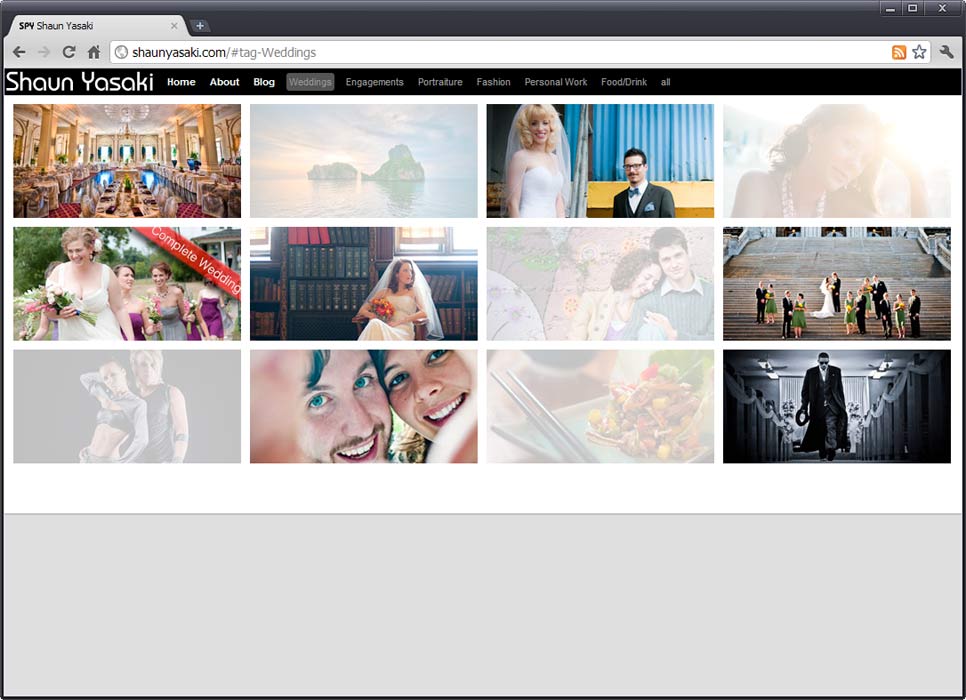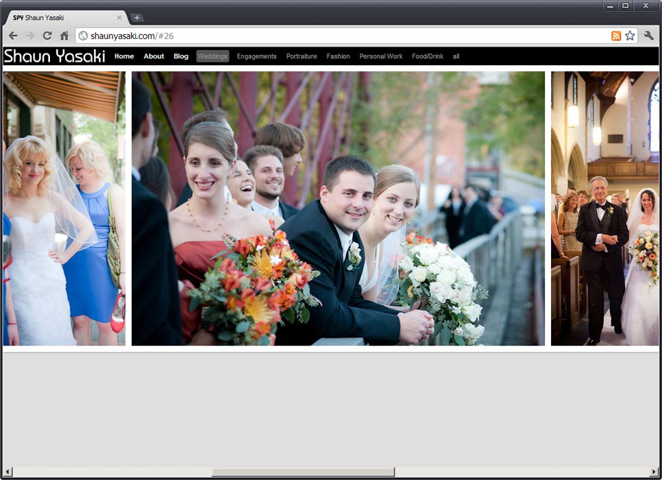
For this design, I thought back to my photography critiques during college and how we simply hung our photos in a line on a white or black wall. I thought about why this worked so well. Of course, it was practical for twenty students in a classroom, but it also provided a simple hierarchy without distracting from the photographs. I wondered how this would translate to the web or if the space and mediums were simply too different. I realized, however, that there was something about the horizontal flow that seemed natural to the mind. Moving from picture to picture horizontally placed each photo in a relationship with the next. That idea became the core concept behind this design. Like the photos on the wall, I wanted the emotion and energy of each photograph to overflow into the next. I feel I was successful in this aim and that it works so well for Shaun.
I struggled at first to come up with a way to display what I felt was the necessary amount of information while staying true to my original idea. My sketches show this well. During a progress report on the design Shaun explained that clients seeking a wedding photographer ultimately make their decision based on two things; the style and quality of the photos, and the personality of the photographer. With this in mind I simplified my design to reflect Shaun’s input. The result was a thumbnail based main navigation with textual categories to help users narrow down the options. A simple about page provided all the textual voice Shaun needed.

When coding out my design I choose to use an AJAX/PHP powered, portfolio centric, content management system (CORE) that would allow Shaun to control his content. I made sure to give Shaun the ability crop his thumbnails manually as he saw fit, an important feature for photographers. Lastly, I included a Google Analytics account to track site metrics and statistics so he could put his bachelors degree in business to good use.