Overview
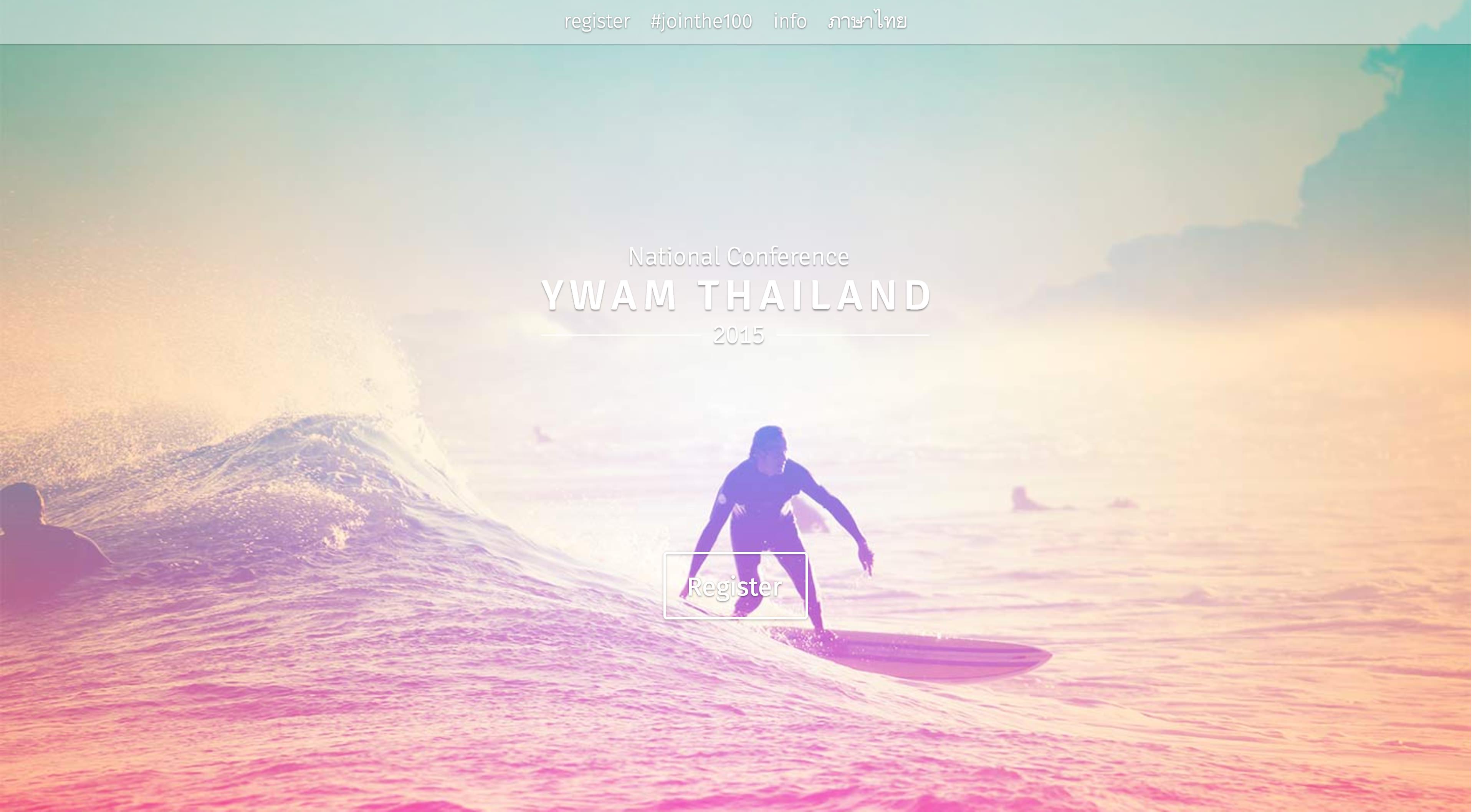
There are many great non-profit organizations doing amazing work that don’t have a quality technology infrastructure. Youth With A Mission (YWAM) Thailand’s 500+ volunteers across over 100 organizations gather biannually for an important time of unity and celebration of the work they do all over Thailand. The conference’s communication and media were designed and built to be both efficient and inspirational, providing for a seamless experience from registration to checkout.
User Stories
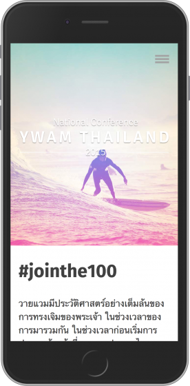
Elinor, 50 years old, is a long time volunteer hospice nurse serving in a rural part of Northern Thailand. She doesn’t have consistent computer access but manages to stay connected to the world through her iPhone. She looks forward to the conference as a time to connect and learn from others. Registration was easy on her phone and during the conference she comments to a friend how excited she was to get together.
Mark, an adventure seeking 19 year old, felt led to volunteer abroad as a gap year. He’s shot 4 short format video pieces since arriving that have helped 3 organizations raise over 20,000 dollars for the work they do. He hopes to make deeper connections at the conference and find new inspiration in the stories shared by others. Two months before the conference Mark receives an email about a special speaker. During a lunch meeting the next day he tells some colleges who are going with him to the conference about the speaker. While taking some time to relax at the conference a new friend comments on how consistent and thoughtful the various design elements have been.

Design Goals & Challenges
 In working closely with the planning committee to assess their needs, we found that they lacked metrics to help make better informed decisions in the planning process. This made it hard for them to find ways to increase event registration and engagement. My goal for this project was to show those in attendance that they were valued as much as the work they do by offering them a first class event experience. I started by making it a point that the conference’s Thai and English experience not change or be diminished because of language. Drawing from the event’s theme, Catch the Wave, I wanted to focus the design and diction in a way that communicated momentum, impact and unity. It was also important for attendees to feel like they were in a space where they could step away and contemplate these things relative to themselves and the organizations they represented. These were all things I gathered at various times in conversation with the planning committee.
Outcome & Execution
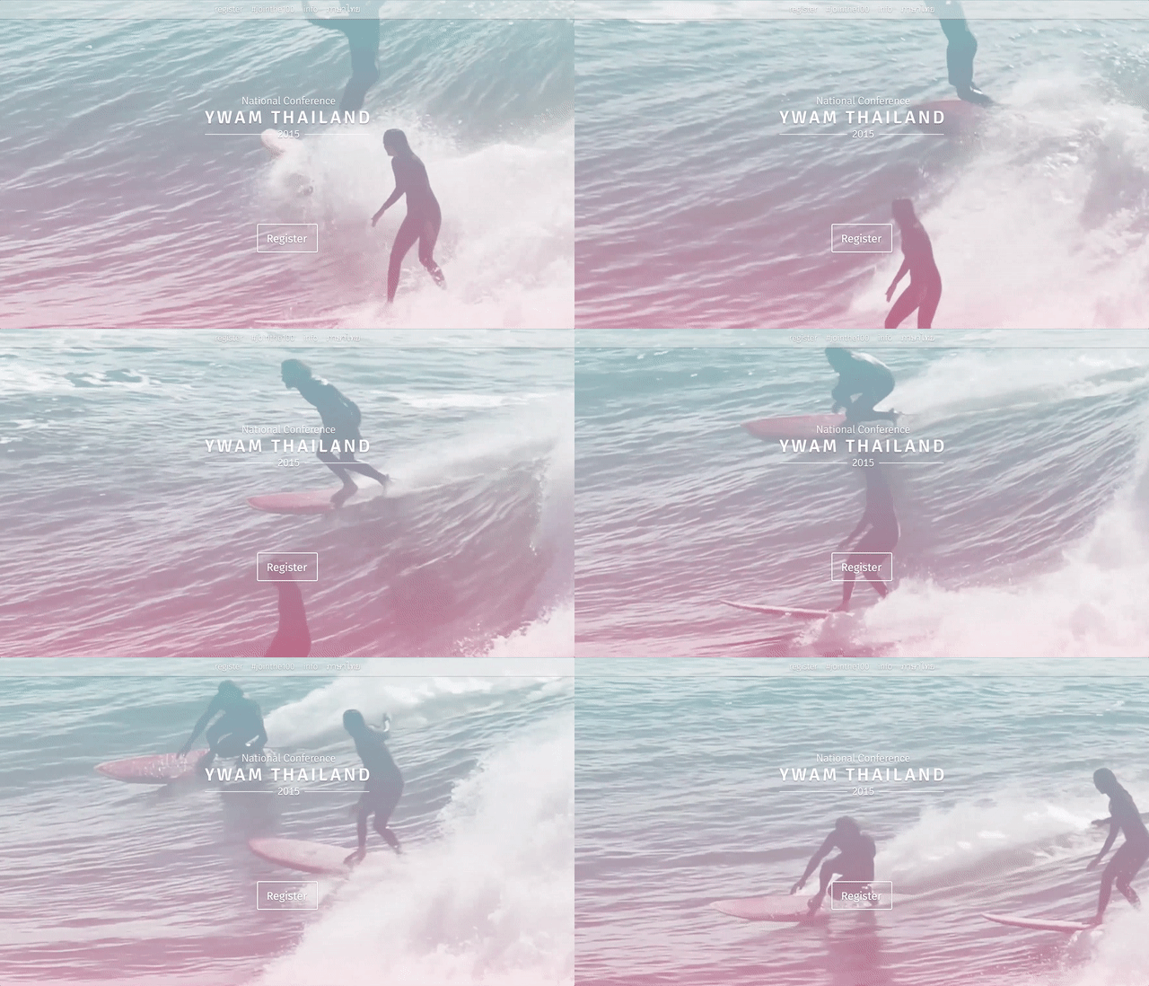
After figuring out what technology could be used where and to the greatest effect, I started by building a website that could handle the conference’s registration and information needs. Built on WordPress for ease of handoff, the website includes YouTube and Google Maps API integrations to create a more dynamic and rich experience. Automated transactional and drip email campaigns focused on increasing event registration and engagement were started 8 months leading up to the event. Communicating in the language attendees speak goes a long way to making people feel comfortable and cared for. Overseeing a print designer, I made sure everything was pulled together around a cohesive design for the event’s theme and included a branding package that covered everything from slide deck templates to conference manuals and name tags. Google Analytics was used to collect information on engagement leading up to the event including registration click-through and completion. During and following the event, satisfaction surveys collected data on things such as event format, price and logistics. In the debriefing with the planning committee following the conference, everyone spoke of how smoothly things ran while data collected verified attendee satisfaction and areas of improvement.